Fox & Cooper Limited
Client:
Temporary power distributors
Brief:
To create a new brand logo which could then be used for a presentation pack.
Solution:
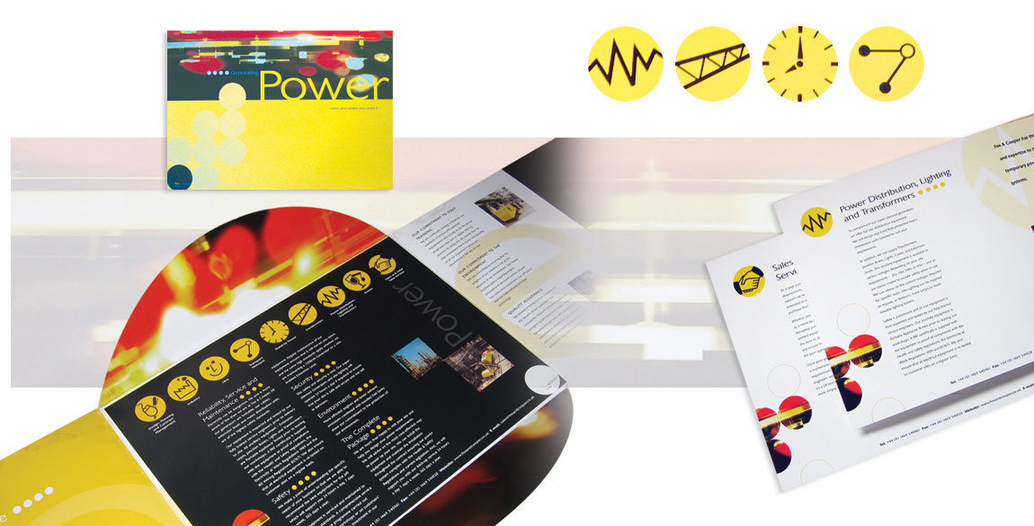
The client wanted a simple, impactful typographic route and this was achieved by introducing a black circle which would be easily identifiable with the wording being secondary. The objective was to engage customers in the first instance with the circular shape and quickly associate this with the company name. The typography used was a simple sans serif typeface in strong vibrant colours of red, yellow and white to maximise the contrast to the background, resulting in an effective brand logo which could be easily applied to any design platform. Following on from the logo, a presentation pack was designed to showcase the business, which consisted of an outer folder with page inserts. The circle theme was continued throughout, echoed in the folder flap design with circular icons representing each sector of the business.
Gallery