The Frostery
Client:
Premium wedding cake designer and shop
Brief:
To create a logo to represent the beautifully hand-crafted nature of this artisan cake business.
Solution:
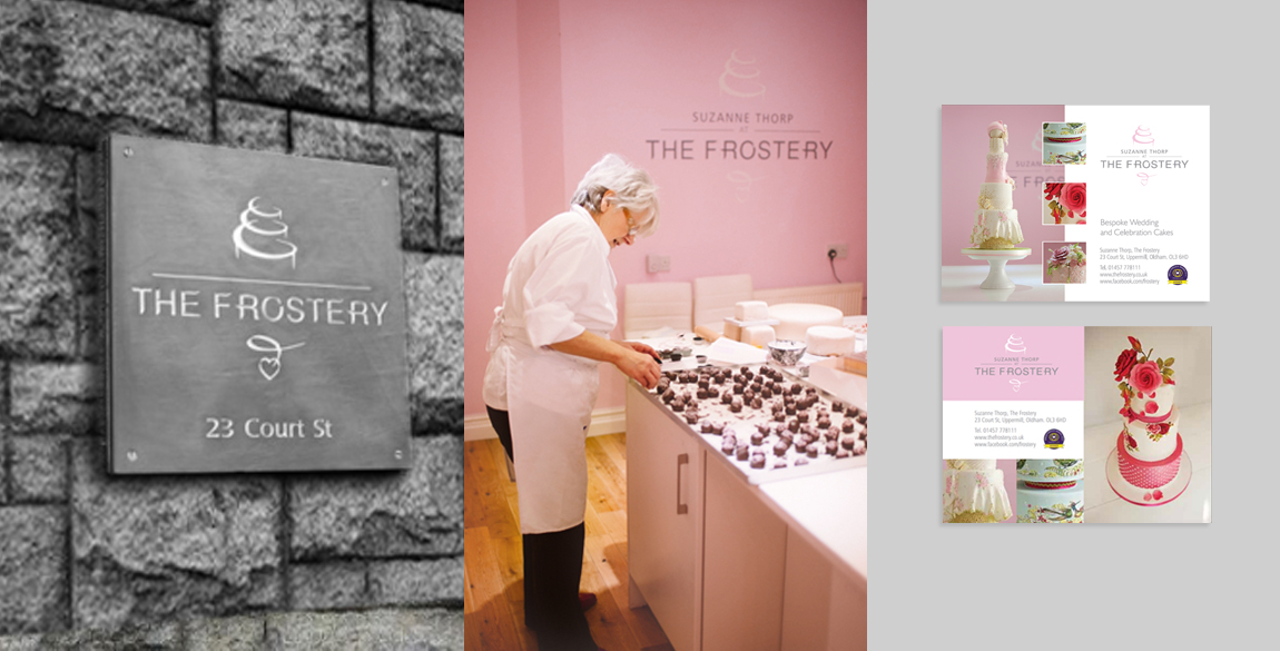
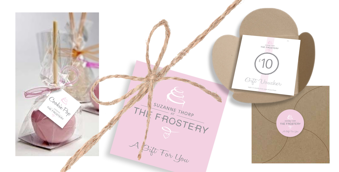
The client came to me with a very rough idea of using some kind of calligraphy in the design. With this in mind I experimented with various design routes developing this idea. My design ethos is that every element of a brand logo needs to be there for a reason and I wanted to create a way of using the calligraphy concept to represent the nature of the business. The result was the Introduction of the three tier cake scrollwork with the addition of the heart flourish beneath the wording. Furthermore, as the client is such an integral part of the brand, in essence, ‘she is the brand’ it was felt very important to include Suzanne’s name in the design, adding value and assurance to any potential customer. I now have a good understanding and relationship with The Frostery in Uppermill, Saddleworth and continue to work with Suzanne, creating advertisements, tags, Christmas promotions and have recently designed gift vouchers and a presentation wallet for her flourishing business.
Gallery